
|
DAVID MIRETSKY
Family - 2001
oil on panel
17.25 x 14.25 inches (43.81 x 36.19 cm)
		David Miretsky
		My art is about people. I see them as being just as beautiful as everything in nature. The character of a
		human being interests me greatly, especially the social aspect. I was born in a time of great upheavals:
		wars, evacuations, and famine. I saw people standing in bread lines and parading before the elite. My
		discovery is that, in a crowd, one loses individual character and absorbs the character of the group. I find
		myself with an easel standing amidst this activity. I also can find myself in an apartment watching a family.
		I may see them at the dining table, or maybe see only a woman with a child. I observe the quiet, peaceful
		contemplation of the family and the congruity between the people in the setting.

		David Miretsky, 2002
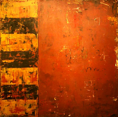 |
BILL
FISHER
Ochre and Oxide - 2005
oil and encaustic on wood
72 x 72 inches (182.88 x 182.88 cm)
		Bill Fisher
		I paint in a reductivist manner relying on surface and spatial tensions to convey the content. The imagery in
		my work is based on childhood memory, appropriated diagrams and reflections of the visual realities of
		urban decay. My work expresses a continuing dynamic of time, experience, and personal perception.
Bill Fisher - January, 2002
 |
PEDRO CUNI BRAVO
La Salle Street - 2001
encaustic on canvas
22 x 33 inches (55.88 x 83.82 cm)
		Pedro Cuni Bravo
		In my work, I seek an intensity that emerges from naturalness.  I look for the feeling of normality found in the
		harmonic relationship between a person and his/her physical and spiritual environment, in which the desire
		for well being is fulfilled. In other words, I want to paint the world as I would like a normal one to be. That is
		why I apply this criterion as the main guide during my painting process.  Sometimes I insert an element or
		a brush-stroke which in theory could be effective, but when I see it, does not turn out to be natural in relation
		to the rest of the painting.  Then I know I have to modify it. The double intention of normality and intensity
		makes me also change those elements that I considered to be natural but once painted, prove to have no
		intensity.
Pedro Cuni Bravo - January, 2002
 |
CURT
BARNES
BTP - 2000
acrylic on wood
10 x 13.5 x 5.25 inches (25.4 x 34.29 x 13.33 cm)
		Curt Barnes
		My aim is an impossibility: to get two categorically different dimensions to talk to one another, to meld with
		one another, even as they insist on their separate identities. I have been involved with the chemistry of these
		interactions for years. It is a perceptual mare's nest, full of surprises, dislocations and delights. (It is an
		extension of my worldview that, if verbally stated, would sound something like this: only a thin layer of
		presumption hides a series of contradictory perceptual structures, all of which are illusory.)
		In these latest incarnations, the curving panel asserts an aggressive physicality. Forming it asymmetrically
		makes it still more dynamic. The reflective, silver paint affirms the panel's extroverted dimensionality. Of
		course it's more complex than that Silver can simultaneously affirm and deny a surface.
		The painted and penciled lozenge shapes create the most elemental of interior spaces. (One shape may
		subordinate to the surface, but two or more want to establish a picture plane.) The logic of one of these
		realms can help determine the logic of the other. This does not necessarily make for harmony, however.
		The smallest pieces began as studies but soon got out of hand. They are finished works unto themselves.
		The lozenge shapes don't seem to distort with the curvature, only narrow as the viewer moves back and
		forth. But because of the curved structure the composition changes. Each painting is thus many paintings.
		These works need and use and reward time. Their surface serenity masks various levels of contradiction
		and paradox. The metallic surfaces and smooth shapes may recall Art Deco or 50's sci-fi. I enjoy the
		associations. Cultural irony is of a lesser order than visual irony but has its charms.
. Curt Barnes - January, 2002
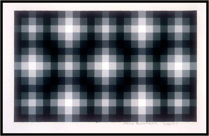 |
OTHO BRANSON
Untitled #3 - 2001
acrylic on paper
16.25 x 20.25 inches (41.27 x 51.43 cm)
		Otho Branson
		My work tries to show rhythm, pattern, variability and dynamic equilibrium.
		I start with a field (a square or rectangle). I then overlay a grid (symmetry) over the field, using vertical and
		horizontal lines, creating a skeleton or structure.
		Color/shapes (of primary and lot neutral hues) are applied over the skeleton in a rhythmic way to create a
		dynamic and variable visual effect.
I hope to achieve dynamism, harmony, balance and variability in my work
. Otho Branson, 2002
This web site was designed and created by FLAIRWORX ©2002 OK HARRIS All Rights Reserved